In evaluating light quality in any environment, we have to keep in mind how the eye perceives light. As light distribution goes, we perceive light first on vertical surfaces, and last on horizontal surfaces below eye level (the ground, the floor, the work plane). Light on vertical surfaces conveys spaciousness, brightness, and openness; dark vertical surfaces convey intimacy or privacy.
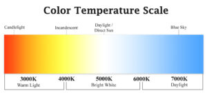
Perception of light level also depends on the color temperature. The more blue-white the light, the higher the perceived light level, even when foot candles are the same. Warmer color temperatures are often perceived as a lower light level. This is useful when considering task versus ambient light; cool task lighting can provide more visually perceived light (helping the care provider), while slightly warmer ambient light can feel less intimidating (helping the patient).
High levels of contrast tend to portray excitement, but in the medical environment, can cause confusion for patients with aging eyes, and work against eyes of all ages as the eye’s adaptation from dark to light takes time, and decreases with age; thus, the lower light level areas often feel dark, and the higher light level areas, painfully bright. We should strive for good uniformity in the medical care environment, especially at low light levels.
In a patient care setting, we need to consider two very different needs and experiences.
First, let’s consider the needs of the care provider. There must be adequate light to examine skin color and texture, and shadows are important to see variation in skin, depth of lesions, etc.! That means that totally indirect light sources don’t work for care providers doing critical exams unless there’s also daylight. 3000-3500K (halogen color temperature) is typical, but I believe it’s wise to mockup exam rooms with color temperatures ranging from 3000-4100K and let the practitioners give input on their preferred color temperature. It’s feasible to have a portable exam light or local task lights such as recessed ceiling fixtures that are on during the critical part of the exam. The rest of the time, these lights do not necessarily need to be on.
Second, we must consider the patient experience. Indirect, lower level lighting that is warmer in temperature offsets the perception of a sterile, institutional exam room. With reasonable uniformity, the light levels won’t seem low to the patient while they’re waiting for the practitioner, and during any initial discussion. For patient purposes, low level 100% indirect light, like fluorescents over the exam cabinets reflecting onto a white ceiling, are soothing.
Let’s not forget context. Corridors and halls are often dreadfully overlit. Realistically, between 5-15 footcandles, depending on the users, can get the job done, especially with good uniformity. When you go from a corridor that has 5-10 footcandles to an the adjacent space with 25-30 footcandles, the perception is WOW! This place is well lit! However, when you have 30 foot candles in the corridor, an exam room with similar average illumination feels dim, especially if that light is all on horizontal surfaces. By sensitivity to context, we increase the perception of brightness by keeping adjacent spaces at a lower light level as much as feasible.
We also need to consider the light reflectance value of the space’s finishes. Lighter colored finishes create more of an overall perception of brightness.
As with all well-designed lighting solutions, there is not a one-size-fits-all approach. We need to provide flexibility in controls that allow the lighting to be used in varying capacities, such as during the critical portion of an exam, versus when the patient is awaiting the care provider’s arrival. Flexibility and user control has been proven to decrease energy consumption and increase user satisfaction. For that to be successful, the users must be “active users” and engage with the capabilities designed into the lighting system.


