SEVEN Tips to take an interior space to the next level:
Most people invest a good amount of time and energy in tailoring the spaces they inhabit to their personal needs and preferences. This process is different for every person, as it often relates to taste rather than rules or standards of “what makes a space pleasant”. There are however some underlying concepts that generally make spaces even better! Here are some simple tips in how to take any space to the next level!

1. Multiple Light Levels
Light plays a crucial role in the feel and functionality of any space. The amount of light, the intensity, the color temperature and the light fixtures themselves are all personal preferences. But one thing is true, any room can benefit from having a variety of light level options. Most rooms will have, by default, an ambient light level; which is composed of both daylight and general light. Daylight is any form of natural lighting that is being let into the bedroom through windows, skylights, doors or any other opening. General lighting is usually one or two main lighting fixtures which flood the entire space with light when daylight is not sufficient or is unavailable. Besides having ambient light, any space will benefit from two more light levels: Task lighting and Accent lighting. Task lighting is any light fixture or lamp that provides light for a certain activity; for example a desk lamp or a reading light. Accent lighting is any light fixture or lamp that highlights a certain area of the space; for example a table lamp sitting on the nightstand. All three light levels can be used at the same time, creating a layering effect. Or the user can choose to turn some levels on and some off, depending on their needs or preferences. Having this ability takes the experience of the user to the next level.
2. Good Ventilation
No matter how pleasant the design of any room, if there is no proper ventilation, it won’t be an appealing place to be. To ensure better air quality ducts and vents should be kept clean, and windows opened periodically to provide fresh air flow. Cleaning air ducts and vents will prevent mold build up and accumulation of dirt which can result in a myriad of problems, from the room feeling “stuffy” to serious health conditions related to the prolonged exposure of poor air quality. Good air ventilation and an appropriate amount of fresh air will take your space to the next level and ensure better health for its inhabitants.
3. Efficient Circulation
It is crucial for any space to have areas of free circulation. It’s important to provide ample room to walk around a space without having to duck, make awkward turns to avoid hitting corners or turn sideways in order to squeeze by. These actions make the experience of the space less pleasant and communicate that not enough thought was put into the space planning of the home. Trying to pack rooms with too many items, or creating too many “work areas” in any given space not only makes it difficult to navigate, but also gives the space the appearance of being smaller than it really is. Ample circulation opens up a room, improves the flow of activity in the space and takes it to the next level.
4. Furniture Placement
When choosing where to place furniture or accessories, consider the center of the room rather than along its perimeter. This is especially true with seating areas. Often times seating areas include a sofa or loveseat placed against a wall, or close to a corner of the room. Choosing the center instead allows for circulation around and through the room instead of just through the middle, as well as making the social area the focal point, which takes your space to the next level. And as I side note, if you like symmetry here is some good news. Symmetrical seating areas tends to be more appealing to our human nature; since symmetry speaks to our psychological desire for visual and physical balance. They also encourage social interaction between larger groups as the sense of equality [in relationship to the room] subconsciously helps people open up.
5. Clear Organization
Ever heard someone say “I can’t focus in a cluttered space”? Well, that is because our brain is constantly trying to make sense of everything around us. If there is an incomplete image, our brain will try to find the complimentary portion of it. If there is a large amount of information presented to us, our brain will try to break it down, process it, organize it and understand it. Same goes for spaces that have a high level of clutter. Mentally, the brain cannot relax as easily as when a space is neatly organized. There are of course exceptions to very rule, but in general, your brain will have a more pleasant time processing a room with a logic to it, instead of appearing to be random. “Categorizing” the items and areas of your space, as well as minimizing the amount of things packed into a single space, provide for a better experience and a more visual perception of our surroundings; taking your space to the next level.

6. Defined Color Strategy
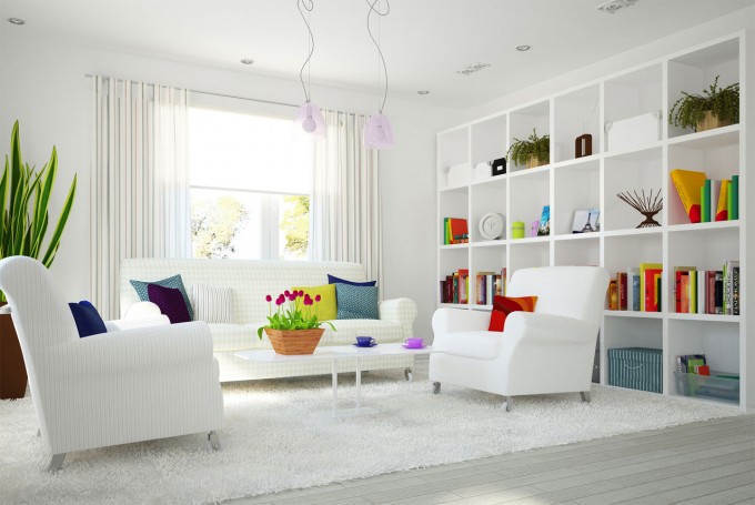
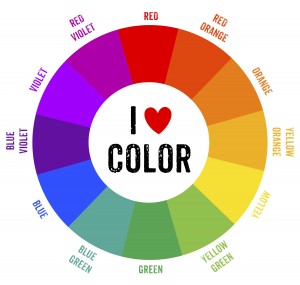
Along the lines of the human brain trying to make sense of patterns and information, it is also a good idea to have colors in your space that all follow a “plan”, a category. This could be virtually anything. Color is probably the most arbitrary of all interior design aspects, as there is not right or wrong answer—instead if a color works for you, then it is the right color. There are however countless studies regarding color psychology and theory; but that is not the focus of this blog. Regardless of your taste in color or what mood you want your space to communicate (which can be determined among other things by the selection of certain colors), the focus of tip #6 in this blog is to encourage having a color “strategy”. Some examples of this can be: Neutral rooms, Vivid rooms, or Accent-driven rooms. Neutral colors can be calming, neat and sophisticated. In general this color palette appeals to people who prefer open floor plans and clutter-free spaces. Neutral spaces are non-committal, and allow a wide range of materials to be used, since they won’t clash with the color selection. Wood finishes and pieces are often favored in neutral-colored spaces. Vivid spaces can be risky, but if done well, can be a fun and energetic environment to be in. In these cases the walls may have a color which is different than the furniture and the accessories but each element holds its own. Accent-driven spaces are neutral spaces that include what can be called “moments of color”. For example, an accent-driven living room may include a white sofa and love seat, a gray area rug, silver and crystal chandelier, black end tables, a bright turquoise lounge chair, and two blood orange table lamps. No matter what you choose, the point is to have a defined “look” for the space.
7. Material Selection
This last tip is very important because it points out three aspects of finishes that go hand in hand: Material, Texture and Pattern. All of which can coexists amicably if combined well. Any given space will have multiple materials, but it is best to not exceed more than three types of materials per surface. When it comes to pattern; less is more. Including too many patterns in one single space can be challenging. One or two per space should provide plenty of visual interest. And the important thing to remember about texture is that unique or very busy textures are like accent colors: they will want to be the center of attention.


